A comprehensive headache relief app that tracks, treats, and helps you avoid various headache types.
Why Noggin?
Unlike many migraine-focused apps, Noggin helps users manage various types of headaches
Most of the headache apps in the market are only targeted towards people suffering from migraines and only have the resources to only manage migraines. These apps do not consider people suffering from other kinds of headaches like sinus, hypertension, or even the possibility of suffering from more than one headache at the same time.
For example, the average headache apps are of no use to me. And it turns out that there are more people like me!
Pain Points
I don’t know what type of headache I am experiencing. And without identifying the type, I cannot determine the correct treatment for it.
I struggle to identify my headache triggers as generic lists don't apply to me. It is also hard to track and control triggers to prevent headaches.
I find it challenging to track my headaches and the time lost, leading to inaccurate analysis for my doctor.
Brag points
Identify the type of headache you’re experiencing in minutes
Access a storehouse of your personalized headache triggers
Keep a track of every headache type experienced in a month.
How Noggin Works
Personalized Headache Tracking
To analyze and predict headaches, a user would be prompted to fill their headache data by answering some targeted questions, the very first time they open the app. Within minutes, the app will be able to find patterns in the previous headaches that would be helpful while avoid future ones.
Record your headaches and get instant diagnoses
A simple diagram with color-coded pain areas and different head views are designed to help the users pinpoint their pain areas easily. A slider allows the user to record their pain level. After putting in the basic information, the app shows some quick remedies to combat the headache.
Get help in identifying your headache triggers
It was evident from the pain points that a generic list of triggers is not what most people want from the app. So, users have an option to type in custom triggers applicable to them and refer to them at a later day. Having said that, there is an option for users to not add additional triggers for those who are satisfied with the generic list.
Get updates to avoid your personalized headache triggers
As per the user interviews, people want to get notified on their avoidable triggers and Noggin enables users to get updates on triggers like certain weather conditions, stressful schedules, or even inadequate sleep.
Keep a track of all your headache days
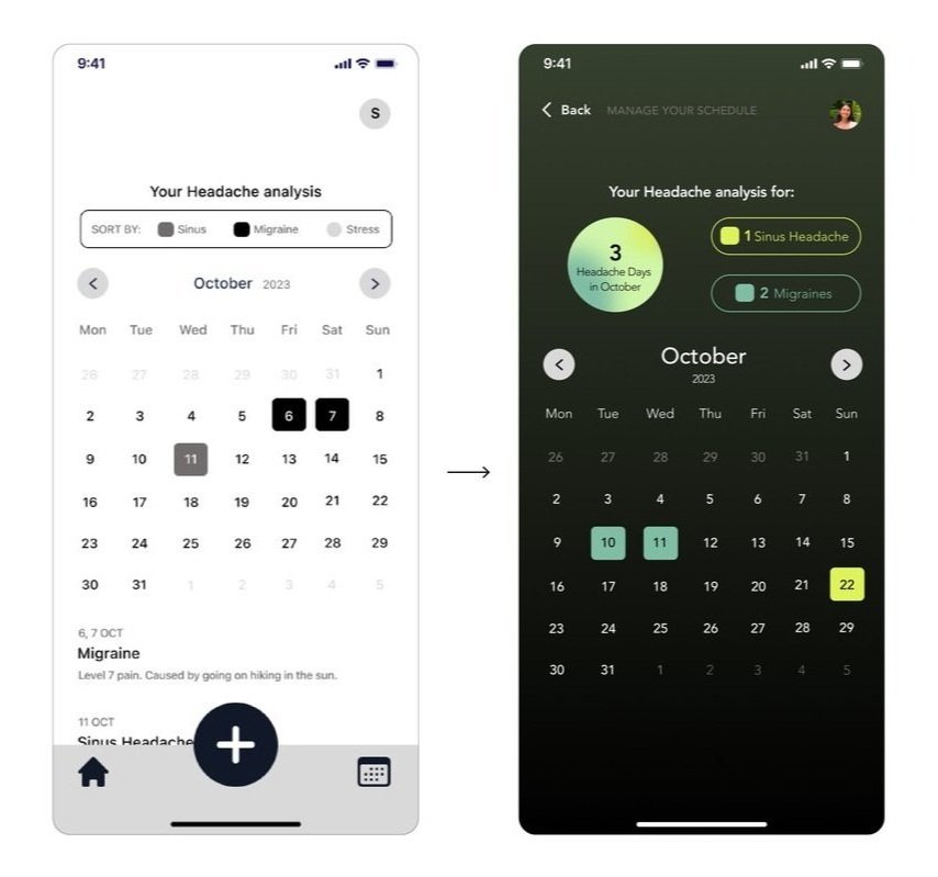
All the headache days are visible at a glance to keep a track of them. There is an option to sort the days as per headache types in case a person suffers from more than one type of headache. Clicking on a date, shows the in-depth headache analysis of that day.
View all your headache data in one place
Different headache-related information has been distributed throughout the app. You can perform actions like read about managing headaches, track sleep, and take a look at your headache analysis.
Integrating the design into wearables
Using Apple Watch’s sleep, screen time tracking for avoiding headaches
Receive alerts based on weather, screen time, sleep, and schedule on the go with the use of Apple Watch.
UI Style Guide backed by research
Benefits of dark colors and green light therapy
According to research, green light therapy is an effective treatment for various types of headaches. Additionally, exposure to light screen and the blue light emitted by the screen is counter-productive for headache treatments. The color palette thus uses dark tones of green and very minimal light colors.
Various shades of green have been used as accent colors to denote different headache types through the screens.
Button Usage
App Icon Usage
The high contrast and minimal design of the app icon ensures its visibility even at the smallest scale.

Design Improvements through Usability Testing
BEFORE: screens to Record a headache
The button to toggle between front and side views was not noticeable to almost all participants.
AFTER: screens to Record a headache
The button was redesigned to appear clickable.
The tabs at the bottom of the diagram made more noticeable and clickable
While all the participants thought this way of identifying your pain area was quite effective and helpful, only one participant switched between the 2 lines in the middle to look at the side view of the head.
BEFORE: Causes screen
The earlier version only had the option to add additional triggers.
AFTER: Causes screen
The updated screen was finessed to be more inclusive in terms of language choice and button options.
An option to just add triggers from the list along with additional triggers
One participant raised a very important question on this screen. “What if the user is satisfied with the list of triggers and doesn’t want more options?” This led to adding an option to just select one of the triggers from the list and proceed with an option to add more. I needed to consider that some users might find what they are looking for in the list and may not need to type in more triggers/causes.
BEFORE: Monthly Analysis screen
There was an option to sort headache days as per the type of headaches experienced in a month. However, the sorting feature did not seem clickable.
AFTER: Monthly Analysis screen
The updated calendar used a similar style of buttons for the sorting button which made it seem more clickable.
Headache sorting tab enhanced to stand out more
None of the users thought that the sort by feature at the top is clickable as it looks different that the other clickable elements in the app. After prompting them to click around, they understood the purpose of this section.
Now all this is interesting to me but I understand that it might not be for everyone.
But if you're like me, view the entire process.
Want to see more UX projects?
Do check out these UX Case studies!
EcoWomanist Institute X SCADpro
Responsive Web Design | Social Media Strategy
Netflix Snack Genie
Multi Device System UI


